
Together, we can help prevent sexual violence.
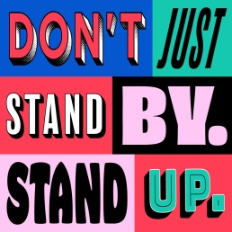
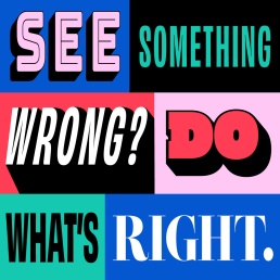
Most people don't want to ignore sexual misconduct, but the fear of being the first to intervene often prevents action. Our creative approach uses different typographic panels to represent many individuals united by a shared purpose. The visual identity reinforces the campaign's core message: collective action reduces hesitation, empowers bystanders, and shows young people that they don't have to act alone.
Client
Government of British Columbia
Project
OOH/Digital Campaign
Services
Creative Strategy
Concepting
Storyboarding
Production Management
Video/Animation
Social Ads
Print
OOH Advertising
Web Graphics

landing page approach
Safe Campuses BC
A key design challenge was balancing the requirements of the government brand guidelines with the need to create a seamless campaign experience. While the landing page's layout and typography were fixed, we incorporated the campaign's colours and graphic elements to maintain visual continuity. This helped reassure users they had landed in the right place after interacting with the campaign, creating a more cohesive and recognizable journey from ad to website.


